
Texts Relating to Exhibitions
(in progress)
Powerful Forms
“My Piece of Art” with Siegmund Schneider, and his picture „Ministerium“ („Ministry“)
Syker Kreiszeitung, 22. Dec. 20127, by Ilka Langkowski
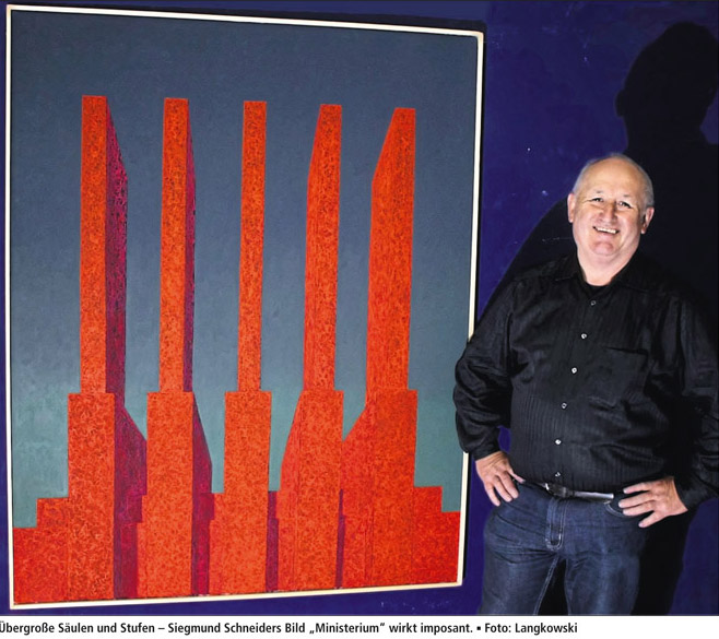
Bremen. „Ministerium“ („Ministry“) is the title of Siegmund Schneider’s painting, which he presents in our series „My Piece of Art“. It shows an architectural building in grand format. Its larger than life pillars and steps produce an imposing, fascinating and slightly threatening impression. With oil on canvas the Bremer artist created his strongly coloured picture “Ministerium”. “It looks like a power plant or a Soviet ministry, monumental like that”, says Schneider. Architecture to him is an expression of the aesthetics of power. This painting is exemplary for a row of works in huge format, in which Schneider arranges architectural and technical forms as enormous constructs. Reduced to form and colour like that, they seem to be monumental. The Bremer artist is fascinated by the connection of power and aesthetic as well as beauty and deterrence. The artist emphasizes the symbolized power and violence with a low horizon, which puts the onlooker into a worm’s-eye view. Schneider enforces the coldness of this architecture with very exquisite surfaces, exact lines and curves. The lifeless scene appears in the light of noon, with sharp shadows. For “Ministerium” the painter used a brilliant orange, criss-crossed by the finest structures, lavender shadows and in front of a blue-green background. In other paintings Schneider puts warm ochre-coloured objects in front of a shrill lemon-yellow or a threatening monument in pink in front of a baby-blue background.
Since Schneider, at the age of approximately 10, got hold of an encyclopaedia of architecture, it is his hobby-horse. Ludwig Mies van der Rohe, architect of Modernism, had him captured. With painting, Schneider found a way to connect architecture and sculpture. “And all this significantly cheaper and with less effort,” he laughs.
Although Schneider stems from a family of painters and has been drawing “since he could hold a pen”, he worked in telecommunication. The path to the “Fachhochschule der Gestaltung” lead through an exam for non-graduates. Today he works as a part-time artist and spends 3 days a week in his atelier. “I look at it as my profession, and work constantly.” For the Bremer, the biggest challenges in art are the marketing and the sales of pictures. “I would prefer just to sit in front of my canvas and not be bothered with the rest,” he says. Nevertheless marketing is a part of it all. Just like the fact that one always is one’s own judge and executioner. One has to admit when one is lost. There are no 90%-pictures. “Either it is perfect, or it has to go.” Do we need art? “If we don’t want to lead a purely materialistic life, then, yes. I need art like others need religion. As something that surpasses the average. It is the quest for knowledge. In society we need art by all means, because through it we can reflect ourselves.”
Amongst the artists which are most important for Schneider are Gerhard Richter and the Renaissance painter Matthias Grünewald (15./16.century). To Schneider, Richter has a special way with colours. “In his abstract paintings he’s a genius. I learned much from him.” And with his Isenheimer altar, according to Schneider, Grünewald achieved the ultimate goal an artist can achieve. His magnificent, hinged changeable altar showed pictures to the terminally ill patients of a convent’s hospital and hospice. If Schneider was asked to send a painting as a message to somebody of his choice, he would send his pink “Minotaur” to the Bundestag (German Federal Parliament). “As a warning of the resurrection of right wing radicalism, while the whole world is going nuts.”
Opening Speech for the Exhibition at the “Haus am Wasser “
Author: Hajo Antpöhler
“At the age of 13 I had read every book about architecture available in the public library of Delmenhorst, says Siegmund Schneider. 20 years later, architecture, modern architecture, is still the almost exclusive motif of his paintings.
Preceding the painting are countless sketches of buildings, not architectural sketches, but drawings of existing buildings, often famous works of architectural history, or his own “inventions”, to be more exact: compositions from building parts and elements in the style of modern architecture.
The sketches do not develop as a blueprint for a particular painting. The impulse to paint a picture is triggered by the desire for colour, the desire for a distinctive sound, which Schneider wants to examine and develop. One can see that Schneider is as obsessed by colour as he is by architecture.
What Schneider plans to do, respectively, with colour, instinctively, emotion-wise and desire-wise, is what guides him when he raffles through his sketches, until he finds a piece of architecture which could become the formal frame for the aspired mise en scène of colours.
When in Schneider’s pictures the colour, the brilliant colour mostly, or the aggressive contrast in colours, is occupying the outer walls of the architecture, then architecture is abstracted. The modern architecture is not colourful, but Schneider’s pictures of it are very much so.
Schneider abstracts further: his buildings possess neither windows nor doors, no raster of windows disturbs the looming monumentality of the coloured spaces; people, also, only appear as exceptions, the buildings’ surroundings look plane or like a drawing board sketch. If one would cover the narrow zones of heaven or earth, one would look at a nonrepresentational picture of geometric surfaces, which would only gain spatiality through the radiation of colours.
Schneider conducts studies on colour, which other painters present in a pure nonrepresentational form. Schneider does not paint unconditionally nonrepresentational. I think representational, he claims. Furthermore, there is his interest in architecture. Schneider binds his painting to the condition of the object, and then takes the liberty of abstraction. He combines the representational and the nonrepresentational in one painting.
Schneider also abstracts the environment of architecture in the painting: the green sky as opposed to the red of architecture in the painting “Ministerium” (“Ministry”). That is even clearer the case, where Schneider paints trees or bushes at the feet of the buildings: there he smears the paint thick and nearly formless on the canvas. We may identify them as bushes, but more important is, that here are different painting techniques entering into the picture, different from the geometrical surfaces, whose pictorial treatment already differentiates.
Schneider quotes and adds painting techniques in one painting, this is an approach which has to do with pure, pictorial painting, but with Schneider it allows a representational understanding.
The work with different styles is especially explicit in “Fassadenmann” (“Facade-Man”), that Gründerzeit stucco giant. The painting shows, what Modernism’s avant-garde once fled and what trans-avant-garde today dreams about nostalgically. The painting leaves the uniformity of the other exhibits behind, and it is supposed to! In an impudent way Schneider distances himself from his own style and says: I can do otherwise, I don’t like the taste of dogmas. Art history with its variety of forms and styles should not erect prohibition signs, but make offers, which could be used as tools, that, once invented, are ready for general use.
Colour and form of the paintings favour an expressive effect, despite the coolness and geometrical clearness. Anyhow, colour, for Schneider, represents emotion. When he, like in “Ministerium”, paints similar pieces of forms at perspectival diagonal angles, in a way that makes them seem to grow from left to right, the dynamic diagonals develop, and a steady beat acquires a thrilling drive.
One painting carries the title of an English folksong for a subtitle. I do not know that song, I do not want to know it, so that I do not have to interpret it. I mention this, because it shows, that the associative, the emotional is being captured in the colourful and formal clarity of the paintings, which reveals itself if one occupies oneself with the paintings over a longer period.
The painted architecture is nearly always of an enormous dimension. It is always seen from below, man shrinks before it, is being shrunken by it. The over-dimensional buildings are an expression of power, which is meant to intimidate people.
The buildings are able to enthuse. High towering towers, which literally take off into the however coloured sky, can enthuse, can be expression of an exalted or high flying sense of being alive.
But, with the contemplation of the paintings, comes the moment where unequivocal enthusiasm is no longer possible. The architecture of magnitude and power is spooky, oppressive, threatening. The grade of oppression varies from panting to painting, depends also on the perception of the respective beholder. For my taste the uncanny is most clearly visible in the dark green painting (In the Atelier) where for once a title, “Wachturm” (“Watchtower”), shows the direction. At the other end of the scale there are paintings, which hide their insidiousness behind beauty and harmony.
Schneider does not want to deliver paintings which glorify unilaterally, nor pictures which are all too obvious only critical. He does not want to judge the slice of the world he paints according to good or bad, black or white. The architecture of the exertion of power and intimidation has its fascinating aesthetics. But the fascination is bound to what belittles us, the vileness of power.
Schneider’s paintings are ambivalent in purpose and effect, equivocal. They want to turn the beholder into a sceptic, who does not straighten out the contradictions, but deals with them in a mature way.
Exhibition at the Haus Coburg, Delmenhorst, 1992
From: “Punkt” (art magazine), No. 20, September 1992
Author: Barbara Alm
The Painting of Siegmund Schneider Knows Only One Topic since Years: The Architecture
Big-sized brilliant paintings are staging architectural parts, which seem to look familiar – in spite of the unreality of the colour-contrasts and the bottomless constructions, which seem to be impossibilities, statically-wise. Already through the early architectural paintings what moved the 1953 born artist was gleaming through: the examples of architectural history, especially from the twenties and the thirties of the 20th century. In the meantime he abstracted so far that the colour-effects reached independence on the canvas and play their emotion-laden game. Clear forms and surfaces in a position full of tension. Not without theatrical pathos: he questions space, colour, architecture and power at the same time.
Opening Speech to the Exhibition at the Haus Coburg
Author: Barbara Alms
With this double exhibition the Städtische Galerie Delmenhorst (City Gallery Delmenhorst) contributes to the contemporary discussion of Modernism. Focus point is an art of painting that – or so it seems at the first glance – works the architectural ideas of the 20th century into a fascinating design, defined by beauty and horror. The double exhibition follows the pictures of the young art and asks the question: where are we at the end of the 20th century, which aesthetic and historic lessons do we get out of it, did we use up the utopian supply, like it has been said, did Modernism lose its humane requests during the course of the social changes, which images does young art show us? These questions do not spring up in vain, in the tension between art and architecture: that art, which asks irritating and radical questions, that architecture, which is forever standing in a controversial field of different expectations, where interests of politics and power are presenting themselves in a visual way. The public space, the place of architecture, is always a spiritual and a political space, too. 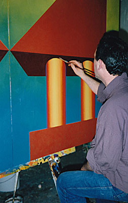
Hitler’s expression for the monumental architecture he desired, “Words of Stone”, is telling. But the power architecture of fascist Germany with its neoclassic vocabulary is only one extreme of architecture as a political instrument. The connection between politics and architecture of the 20th century is what we want to discuss. This is the central question of this double exhibition: “Faces of Fascism” – that is how Hartmut Frank announced his introduction, i.e. to present the manifold faces of Modernism to a scrutinizing glance beyond hasty labels, beyond euphoric heroism, and beyond fashionable damnation. So, do not haste to put the architecture of Modernism into the box of rectangular trunks and soulless suburbs, which have been built mainly in the 50s, by the way, especially where aesthetic decisions did not seem to have been necessary. Look at the ambiguity of shapes, and question the wish for functionality and beauty, ask for the diversity or the forced simplicity, for vitality or monotony. “Architecture is the artistically, correct and grand play of the capacities, assembled under the light,” it says in the famous “Admonition” of LeCorbusier, directed at the “Sir architects” (“Die Herren Architekten”), and this is what you may read at the entrance to the 2nd floor. With the pathos of Modernism awakening, he explains the universal and artistically request of this architecture. He writes: “Our eyes are created to see the shapes under the light: lights and shadows reveal the shapes: the cubes, cones, spheres, cylinders and pyramids are the great primary forms, which the light clearly reveals, their image seems to us pure and tangible, unequivocal. Therefore they are beautiful. Everybody agrees on that, the child, the savage and the metaphysic.” Quote LeCorbusier. Does really everybody agree – that’s what we ask ourselves nowadays in the discussion about Modernism – to what can we agree at all? Does the artist agree to that geometrical world of the 20s, those departing years of Modernism? At first glance we may say, yes, when we look around, and the paintings by Siegmund Schneider seem to speak to us in clear and unequivocal forms and colours. Really, doesn’t it seem to be plain? Do not the paintings speak of cube, cone and cylinder, basic forms, which, as LeCorbusier said, “reveal the light clearly”? Don’t they lie in the brilliant light of a higher, artificial sun, the sun of reason? Don’t they repeat the solid belief in construction and geometry, and the resulting beauty? Here at last we will halt, irritated. Siegmund Schneider has, since he was 13 years old, as he states, occupied himself with the architectural history of the 20s and 30s, with the different faces of Modernism, but also with the language of power of nationalistic aggrandizements, the way they developed especially in fascist Germany and Italy. An additional role play the so called functional buildings of the 50s and 60s in their different expressions in East and West. This has become already like clichés in our minds. Siegmund Schneider, accordingly, allows himself to be inspired by building blocks. It is an artificial world of pictures that is opened by his paintings, obsessively presented, a narrow motif without the possibility of avoidance. Super elevated architectural parts reach into a synthetically illuminated heaven, bottomless, of instable construction. Here there are no people. Here there are no decorations, no openings in the stone, no doors or windows. Where, in the early works, you could still see very graphic representations, fundaments and bases, which suggested the idea of a solid building, and the presentation was still very close to architectural thinking, the architectural fragments of the later years show a complete lack of that basis. They even lose the fiction of a whole. They are fragment. They are without cohesion and justification. They lack the constructive logic and rationality of perspective drawing. Concerning the colouring, a tendency may be noticed to stress the brilliance of pure colours. Their effect is intensified nearly intolerably by sharp contrasts. Several layers of paint grant a profoundness to the coloured surface, up to a spacial vibration. So, the simplicity of forms and surfaces notwithstanding: no trace of quietude. On the contrary: a great restlessness exudes from the paintings. Because on second sight it becomes clear: What seemed to have been depicted as space, as a three dimensionality, turns into a startling surface, i.e. the space destroys itself into surface. It is a highly explosive, depressingly calculated play between construction and its destruction. The architecture in its picturesque beauty shows all signs of terror. The intensified form emancipates itself, grows Babylonian-like into heaven, and loses rationality and humaneness. Black is the most radical colour. Since Malewitsch’s black square, black transcends the 20th century, as colour of meditation and as colour of destruction and nothingness. Black is expression of the utmost renunciation from the diversion by the world’s colourful stimuli. Siegmund Schneider’s black superimpositions lead to a crushing summary: I just spoke of reality and humaneness. These, indeed, were the pretensions of modern architecture. Nothing of this may be sensed in Siegmund Schneider’s paintings. Far more, although only broken and fragmented, but all the more triumphant, the architectural parts remind of representative buildings and decorations of fascism’s places of parade. Furthermore they remind of the futuristic designs by Saint Elias, his pathetically presentations of the Città Nova and the “Italian Pride”. And the inherent doubt takes the floor, about Modernism, having glided into pure formalism, which made axes and symmetry the ultimate instrument, and declared geometrical forms, without looking twice, to be good. The antagonistic siblings meet where aesthetic play was no longer possible. Like the most known architectural painter of the 20th century, Giorgio deChirico – and with this reference I like to come to an end -, like deChirico Schneider actualizes “a senseless and dangerous beauty” (deChirico). But where he placed the symbols of voidance at his stony and lonesome places, for Siegmund Schneider all connection has been interrupted. DeChirico still could speak of a “metaphysical art”, he therefore could still claim universal designs. Siegmund Schneider repeats obsessively fragments of pictures of a merely artificial world that, monumentalized, has lost all complexity and liveliness, all humanity and the reference to the universal. Art is not, as it sometimes seems to be in the “event society”, the place of non-resisting delights or of pictures of an unblemished, humane and social world. We have to travel the road to the inexplicable, and we can only paraphrase the enigmatical and irritating, which is the basic quality of art.
From: „Punkt“, March, 1991
Author: Ute Ocasek-Fürg
 At the first glance, Siegmund Schneider’s big-sized paintings are being determined by motives that remind of architecture of the first half of the 20th century. The concentration on the colossal and ritualistic of that time results from the omission of everything that hints at the habitableness by men. The compactness and taciturnity of the sculpture-like buildings is supported by a differentiated colouring. Brilliant and matt, unbroken colour and colour that only emerges before the eye by simultaneously looking at different nuances, support the illusion of something built, but at the same time makes it seem completely surreal. Because the coloured surfaces are delimitated from each other (sometimes even by applied lines), at closer inspection a series of individual pictures advances at the beholder, each of which is designed with the utmost sensitivity. The pictorial possibilities: architecture, sculpture and painting, are taken into consideration by the artist, and they seem to be connected, simultaneously, in each work. Such a procedure outreaches pictorial action and makes the connection with other areas a possibility.
From: Exhibition Catalogue of the exhibtition "Malmaison" , Kunstverein Ganderkesee, 1992
Author: Rainer Weisel
Siegmund Schneider
Form, surface, colour, structure depict the art work by Siegmund Schneider. They are the defining elements in in the artist’s intend to apply all existing and yet-to-be-discovered possibilities in and with his painting, as a means of finding knowledge. This requires, above all, that the momentarily observed state of a system is not being understood as the state of that system in general, but is only described as a moment.
Thus the result of the work can only be foreseen within limitations. It depends very much on the starting conditions. Especially the emotional state of the artist finds its expression through the choice of colours and the processing. For example, he applies colour irregularly on the canvas and overpaints it with white, until a milky-bright background is created. The use of a painter’s roll creates a coloured surface. A wooden bar, on which red colour has been pressed from the tube, creates random structures on the yellow coloured canvas. The different working methods include the possibility of permanent changes during the creative process. Meditation and ecstasy mark the polarities, between which the artist moves, or which he transcends. Siegmund Schneider recycles the pictorial space in a non-representational way, before he transforms it into a representational painting through pictorial strategies. Then, strictly geometrical forms enter into the painting. They are the results of countless sketches, where the problem has been questioned methodically from different angles. Linear – in search of the smallest undividable. Two-dimensional – in search of interactions. Three-dimensional – in connecting systems, which do not seem to be connected.
In this connection, the resulting architectural forms may very well be understood as symbols of a higher reality. The architecture has been transformed into a thing, an undefinable object, i.e. disconnected, separated, estranged from the human who once created it, itemised. In the specific use of the geometry, in the approach to the perspective and mathematical proportions, the inherent strangeness of the constructions are emphasized. Different ways of painting and the use of bright colours, which very often contrast aggressively, enhance and super elevate this perception. Nevertheless, we are still strangely connected to the works. They affect us in a fascinating and, at the same time, uncanny way. This impression is intensified by the hermetic of the depictured buildings. We, being on a quest, can neither enter them nor exit them. Also, foregrounds and backgrounds provide us with only limited information. Above all, they capture a void, even though solitary items appear quasi as carriers or actors of a coded, impenetrable act, and between them inexplicable relations are enfolding. Maybe we are going to lose the orientation, even appear to be displaced. The attempt to escape into a naturalistic form fails. We could withdraw from the works of Siegmund Schneider, but would lose the possibility, presented to us, to approximate the constantly changing truth of our existence. I plead for its acceptance.
From: „Delmenhorster Kreisblatt“, 1991
Author: Karl-Heinz Montag
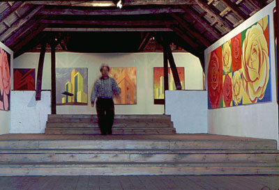
Ganderkesee. Malmaison in the idyllically situated Malmaison of Ganderkesee: roses for the ladies, roses for the gentlemen! The Art Club Ganderkesee knows what is due to artists and guests at an opening for an exhibition. In the Grüppenbührener “Förster 11”, the thorny gift of nature even has a double meaning: since Saturday, next to the cubic painting of architecture by the Delmenhorstener Siegmund Schneider, big-sized rose-motifs by Sabine Hartung (Offenbach) are being shown on the barren but fascinating attic of the the exhibition.
The colourful exhibits are in wonderful contrast to the timbered attic, as not only the Frankfurter photographer Robert Harnischmacher so adequately remarked in his opening speech, facing the “cool” atmosphere; Schneider’s “magnificent buildings” and Hartung’s “Rose-Collection” correspond in their brilliant intensity with the dominant grey and white of the “Försterei”-ambience.
Schneider’s blocs of concrete are sanctuaries of inhuman coldness, constructed into the world with brutal harshness. The comparison with galactic spaceships from science-fiction movies, in reality existing GDR-magnificent buildings and the national socialistic “Reichsparteitags”-architecture is absolutely adequate. The overflowing skyscraper-aesthetic breaks all laws of human life. Schneider’s monuments fascinate with their elegant, but hostilely empty uninhabitableness, at the same time they confront the beholder with past, present and future of the big city life, which is only too glad to worship the megalomania of humongous architectural complexes.
Sabine Hartungs rose-creations lead the visitor of the exhibition into pictorial worlds instead, which “surpass” reality”, as the artist, born in 1965, describes her motivation herself. With titles like “Pink Perfect”, “Rouge Royal” and “Sugarfree”, Hartung circumscribes her serial production of a petalic magnificence, which stands in crude contrast to the urban planning of her hometown Offenbach am Main.
Sabine Hartung relinquishes in the square rose-paintings stems, leaves and thorns. Only the petal is of interest. The ROSE is symbol of beauty, love and virtue. The beholder is allowed to delve into strong colours like brick red, flaming-red and cyclamen-red. Visual fragrance is guaranteed;
The exhibition-duet by Sabine Hartung and Siegmund Schneider may be seen until the 19. May in the Försterei 11. Opening hours are every Tuesday and Thursday from 05:00 to 07:00 p.m., Sunday from 03:00 to 06:00 p.m. A well turned out catalogue is at disposal at location.
From: Delmenhorster Kurier, 1991
Once more a Presentation of Surprise Art
Ganderkesee (me). The exhibition with the title “Malmaison” is inasmuch no exception, as already from the beginning the Arts Club Ganderkesee was striving for a different kind of art than that being shown in established institutions. The target group responded to the visions and utopian ideas, the sound and colour combinations and flexible installations they were confronted with in the huge, light-flooded attic of the Alte Försterei in Gruppenbühren, by always attending in huge numbers. The interest in the surprise art, therefore, has remained huge, even if the always baffling presentations do not seem easily apparent to the critical beholder.
For that reason those responsible for the new exhibition had invited a well-prepared guest, who, being a student of philosophy, had submerged himself in the oeuvre of Sabine Hartung and Siegmund Schneider, and came up with a convincing interpretation. His reflections of the intentions and possible effects of the pictorial ideas thus contributed to the stimulation of the sensitivity of those guests who did not belong to the exhibitors’ immediate circle of friends and admirers. “Malmaison” – that is this new exhibition’s title, fragrant and blossoming with May and flowers, which wraps the guest at first with Sabine Hartung’s romantic aura of big pop- and picture-roses. Yet it is always the same calyx, which presents itself in red and purple, yellow and orange, inviting, seductive, but at the same time strangely cool and rigid. Pressed into a cliché, this sujet is, and the detachment of this cool, noble and high-bred genus of flowers astounds and confuses. Robert Harnischmacher reflected the sentiments of most of the public, when he at first let the rose paintings’ monotony stand as it was, as an invariable given, so to say. But then he offered, in the painter’s name, the numerous possibilities of interpretation and association for the quasi exploding petals, and left it to the beholders to choose from the abundance whatever they would prefer. To each their colour, vision of roses. But can the rigid beauty be brought to life by the richness of colour and coiling petals’ size alone? To some they remain what already Gertrude Stein, often quoted, made to be the only truth: beauty for the sake of itself, because “a rose is a rose is a rose…”
Siegmund Schneider, a trained telecommunications technician, and graduate of the Academy of Arts and Music in Bremen, is no longer an unknown person in Delmenhorst. Through various exhibitions and as designer of the OLB’s façade, Schneider, in the meantime, has earned himself a steady place in the local artists’ community. His offer is much more difficult to grasp than that of his rose-colleague. The distanced, yet emotional critic of society, Schneider, advertises with a cool, cubistic architecture, with geometric shapes, which loom as purely aestheticizing objects into a huge coloured picture area, windowless and doorless. His paintings, too, offer intimacy and distance at the same time: intimacy through the calm, balanced composition, in which forms and surfaces depict firm, law-founded basic elements, to which one may cling. Also, the coloured compositions, interplay and contrast, testify equally of a vigorous and sensitive colour-sentiment. The coolness, in this case, lies in the self-sufficient, geometrical shapes. Like Sabine Hartung always gives the same rose, Schneider, too, depicts himself with always the same geometrical shapes and surfaces. He consciously renounces life, vitality through abundance of contents. All forms strife from the lower edge of the picture to the upper one, resting on a firm fundament and reminding of childhood tower-plays with building stones, which are being pushed over with glee, as soon as they shot high in the air. Schneider’s towers, nevertheless, seem to be built for eternity, they show – maybe – the soulless gigantic architecture of a century which thinks functional and technical, in which is being administered, registered and consumed, in which feelings and nature have but an allocated place. Red and orange are incandescent, shrieking colours. In contrast stands the piercing steel-blue and yellow of a sky. But next to that Schneider also places reposing, harmonic colour-compositions, in which warm colours prevail. So, it is not only the political variant, which is displayed here, also surfacing is the vision of a Greek temple, possibly suited as a stage-setting, as a suggestion of a designing element, which opens itself up to new functions.
The exhibition is supplied with a luxurious catalogue whose financiers were thanked warmly by the chairman of the Art Club at the beginning of the exhibition’s opening. The works by Hartung/Schneider may be seen in the Alte Försterei in Gruppenbühren until 19. May.
From: “Weserkurier”, 1992, on the exhibition in the „Haus Coburg“
Author: Nils Aschenbeck
The terrors which lurk everywhere in modern architecture - that is what the artist Siegmund Schneider wants to reveal. His big-sized works are shown in the “Haus Coburg”, parallel to the photographs.
The in 1953 in Delmenhorst born Schneider occupied himself during the last years mostly with the monumental portrayal of architectural elements. His paintings remind of fascist grand buildings or of futuristic sketches. But his constructions do not hold any logic. In no street of the world are those parts, which are being sunlit by an artificial sun, at home; and yet – they are very familiar to us, in every German suburb they create a very disturbing déja-vu.
The elements of Modernism are being isolated by Schneider, their brutal force is laid bare. All the building details, that hint at life – windows, ornamental elements or letter-boxes – the artist leaves aside. For him buildings are featureless behemoths, whose impact keeps the beholder spellbound and at the same time repelled. He may refer to LeCorbusier, who wrote already in 1923: “Architecture is the artful, correct and grand play of the volumes gathered under the light.” A statement which like a motto is displayed above the gallery’s staircase.
Siegmund Schneider is a student of modernism. But he reduces the aesthetic dogmas of a LeCorbusier to their cynical core, cleared of all utopian ideas. For that he uses brilliant colours, which rather suddenly collide with each other. He exaggerates perspectives and renounces horizons. Also, the three-dimensionality of the elements falls back into a monotonous plainness. His works reduce the modern architecture to an internal logic: behind the beauty lurks the terror. Behind the elegant cubus lurks the timeless and spaceless profanity of eternally uniform surface.
From: Delmenhorster Kreisblatt, 1992, to the exhibition in the Haus Coburg
Author: Karl-Heinz Montag, Delmenhorst
Principle of Variety of the Lego Stone
Schneider’s assembly-line production and a cleverly chosen photo show.
Every time the gallerist Barbara Alms gets ready for the big sermon on modernism, sceptics need be cautious if what is being promoted as wantonly provocative, contemporary critical friction in the Städtische Galerie (City Gallery), really offers more than a fast-consume side-step into Avant-garde. As a result, often partial views are being fanned out, which clarify that the modern painting really has used up its “utopian storage” (Alms) and seems to have reached the end of its road to plain, assembly-line produced boredom.
The current double-exhibition in the Haus Coburg with big-sized pictures by Siegmund Schneider - holder of the Delmenhorstian scholarship in 1991/1992 and just having advanced to creator of the new Placard of the Year with the tell-tale title “Legoland” - and the small, but all the more remarkable choice of architectural photos of the Thirties, leaves in its conscious contrast a rather shallow aftertaste. Even though the critical analysis of Schneider’s colourful flood of pictures is rewarding, the lust for art stays low.
Since years, Schneider tries to simplify architectural forms, to reduce them to the absolute minimum, in order to create new effects. An obscure, monumental mixture of terror and beauty shall deceive the beholder with a false radicalism. In truth only the artificiality of this “picture-world” is staged radically: harsh, rich colours and gigantic fragments like fundaments, socles, left-overs of pillars, and other, geometrically exact constructed bodies rule the contents of the pictures. Schneider’s form-reductions have a monstrous character, in addition, the massive use of colours occupies the eye. The multiple layers in some pictures, which now and then lead to a glorious brilliance, are reconciling.
But this aspect cannot colour away the impression of complaisance, smoothness, ice-coldness. Schneider’s strict works show depopulated scenarios, well suited for the stylish top-office in a sky-scraper. Very decorative, exuding power, and in spite of the strong contrasts of colours, the effects are synthetic and cynical. Too much, much too much.
The 38 year old artist seems to end this creative period. That is the impression the grey-black exhibits give. Here his end-of-time reductive idea is formulated to the point with destructive cynicism. A good-bye to a thoroughly applied method?
Part two of the Coburg-exhibition is modern architecture with the emphasis on the Twenties and Thirties. A photo-series has been created from the collection of the young Nuremberg artist Peter Gössel (also responsible for the concept of the industry-museum), which puts back into focus functional buildings like private houses, factories and other functional constructions by architects like LeCorbusier, Gropius and Aalto, with all their negative and positive side-effects. The cold size and clear functionality blinds, fascinates and shocks at the same time.
Gössel’s pleading for this richly created culture of construction at the opening brought these aspects to effect. The selection of photos contains beside American representative buildings and classics by Bauhaus also “concoctions” from the Third Reich like the Haus der Deutschen Kunst (“House of the German Art”, Munich, 1937) and the Deutschland-Halle (“Hall of Germany”, Berlin, 1936), which represent the cynical megalomania. But the depicted mass-housing of later times also, built in the redoubtable pre-fab-conformism, point, with their social dynamite, to an inhumane direction.
From: TAZ Bremen, 1992
Fascism resp. Avant-garde
In Delmenhorst: A Very Irritating Exhibition of Modern Architecture
Was fascism’s architecture a necessary development of the great architecture of Modernism? Or was neoclassical architecture of impressiveness by the likes of Paul Ludwig Troost or Albert Speer a mis-developpement of Bauhaus-Avant-garde, which was originally dedicated to rationality and humanism?
Confused and thoughtful, one is leaving the Städtische Galerie Delmenhorst, which in these days invites to a double-exhibition worth seeing and cleverly composed. On one hand historical photos of modern architecture are shown (collection Gössel). And together with those the gallery presents a son and exhibitioner of Delmenhorst with the name of Siegmund Schneider, who occupies himself since many years with architecture via pictorial means.
Siegmund Schneider admires the cold order of the architecture by Gropius, Le Corbusier and Hans Sharoun – and at the same time criticises it. He seems to be in search of the idea of Modernism, its substance, and always encounters the beautiful, evil, misanthropic form as a result of power’s arrogance. Big canvases he works over with pure colours, preferably complementary. The contrasts in colour, painful for the eye, decide the picture of synthetic urban landscapes: extremely vanishing edges of buildings make a strong spacial impression, which is always being deconstructed again through “wrong” light and “impossible” proportions.
Schneider aestheticizes like the devil – and the devil is the faceless power that extinguishes all life from these urban landscapes. Even very picturesque parts of his paintings, which stand in sharp contrast against the other monochrome spaces, only seem to be ornamental: soulless.
When you climb to the gallery’s attic, you are suddenly in midst a very sober exhibition of small-sized photos, which does not make it easy for you. The Nuremberg designer and historian of architecture, Peter Gössel, provided pictures for the topic "around 1930”, which remind of the post-modern architectural languages of form since Bauhaus-times. They are photos from private houses, “icons of Modernism”, i.e. by Mies van der Rohe or Le Corbusier. As examples of an international style skyscrapers from the USA are shown. With them, inconspicuously inserted, architecture of the Italian and German fascism, from Milan, Berlin, Munich. Relations which make one think, just as Ford’s contribution to the World Fair in 1939: a giant temple of power, illuminated by a theatrical direction of light, which would have befitted every Reichsparteitag.
A most disturbing exhibition, which irritates emphatically every existing idea about “fascistic aesthetic.”
“The cubes, cones, cylinders or pyramids are the great primary forms, which are clearly revealed by the light! Their image appears to us pure and seizeable, unequivocal. Therefore they are beautiful forms, the most beautiful. Everybody agrees to that, the child, the savage and the meta-physician.,” postulated Le Corbusier.
“The strict line in the temporary construction has a sense, which cannot be abandoned by any rejection of functionalism: it is strongly connected with the tight, intentional processing of reality, which has become the duty of the contemporary generation. A project for a 1000 years...
From: Weserkurier, 1992, about the exhibition in the Gallery Cornelius Hertz
Author: Detlef Wolff
Architecture as Painting
The painter Siegmund Schneider, born in 1953, currently only knows one major topic: the architecture. But the Waller-disciple does not borrow his motives from the full reality of existing building complexes. Instead he designs architecture as a utopian idea and vague possibility. And even that only up to a point. For example, he does not make suggestions on his canvas for the design of urban environment. The result would be cool and misanthropic cities. While his vision enfolds itself in front of Schneider’s paintings, nevertheless its indirect relation to reality is detectable. On the canvases mostly elements of architecture are being singled out and be taken as a reason for painting. One can convince oneself of that in the Gallery Cornelius Hertz (Richard-Wagner-Str. 22) until the 6th of March.
It is details that interest the artist primarily. He boldly makes bows thrust themselves into space or makes supporting beams meet each other, without taking statics problems into consideration. Massive square stones may rest on thin rods. Important is foremost only the geometry of forms. Their relation to each other is a compositely task waiting for a solution. Thereof results, on the next creatory level, the investigation of proportions between mass and surface. At the same time there are emerging architectural landscapes with model character on the canvas. No function is assigned to them.
Amongst the premises of his creative work this aspect is, of course, unimportant. Because in the last consequence everything is about colour: until it enters into the ensemble, such conceived works could exist as drawing board designs. But now, since those monumental complexes appear as coloured complexes, their appearance changes dramatically. In front of changing backgrounds similarly conceived paintings may look utterly different. And here the term colour temperature makes sense. It is demonstrated impressively how colour creates cool or warm moods, changes weights, practically utters invitations or creates a hostile atmosphere. Whereas painting does not mean simple coating, Schneider thoroughly works his way through the surfaces. He puts layers over layers, always changing the brush-work, creates breakthroughs in narrow spaces, from which result vibrations or oscillations. And it is such carefulness in the detail that makes the painting in contemporary art’s situation so special.
Opening day at "Atelierhofgalerie", 2010